

|
|---|
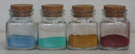
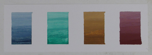
Iron and copper are fundamental metals. The alloys of each are strong enough to form the basis of metalworking, yet different enough to serve complementary purposes within machinery. Interestingly, this relationship is also reflected in oil-based paints and coatings. Both metals are effective through-drying catalysts for oils (in contrast to the surface-drying characteristics of cobalt and manganese), yet they tend to produce opposite colors in the coatings which contain them. Dissolved in oil or resin, iron tends to be red-orange while copper tends to be blue-green. However despite this interesting parallel, while iron compounds are readily available as pigments, copper-based pigments are relatively rare. This incongruity has bothered me for some time, and after the development of my gesso I decided to take the opportunity to try and rectify this situation. In doing so I developed a complete palette of pigments made from copper and iron, which are harmonious with each other and which are useful for coloring objects and artwork.
The goal for this palette was to create a set of colors which could all be synthesized from the minimum number of starting materials, with these materials all being non-toxic and inexpensive. This resulted in a sequential approach, in which the yellow and green pigments are made first, and are then used as ingredients to produce red and blue.
|
|---|
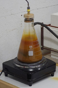
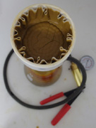
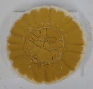
Yellow (iron oxide-hydroxide, FeOOH) is made by the Penniman-Zoph process (US Patent 1,327,061), in which air is blown through a hot solution of ferrous sulfate containing a source of metallic iron. The oxygen in the air causes the soluble iron to precipitate as a yellow pigment, leaving behind free sulfate to dissolve more iron so the cycle can continue. I found that a 5% solution of ferrous sulfate works well at temperatures above 50°C, and that steel wool can be used as the source of iron. Both compressed air and concentrated oxygen can be used as the oxidizer, with oxygen giving proportionally quicker results. The shade of the pigment can be adjusted by both the temperature and the length of the reaction, with hotter and longer reactions producing a deeper color; eventually however, the shade becomes constant as the largest pigment particles begin to settle to the bottom. In oil, this pigment produces a very slippery paint with good covering power, which begins as a dull brown but lightens as it dries to a natural-looking yellow ochre.
|
|---|
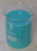
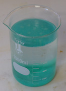
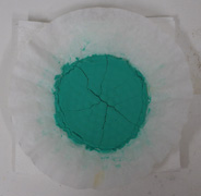
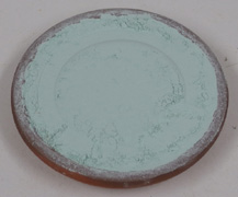
Green (basic copper carbonate, Cu2CO3(OH)2) is made by the reaction between copper sulfate and sodium bicarbonate (baking soda). I found that a 5% solution of copper sulfate, when poured into an equal volume of a 5% solution of sodium bicarbonate at temperatures below 50°C, first forms a blue gel of copper hydroxide, which then condenses into a bright green pigment. The overall speed of this reaction depends on the temperature; near 50°C it takes no more than an hour to complete, while near 0°C it can take as long as a week. This in turn affects the shade of the pigment, with slower reactions producing a deeper shade. For the deepest green it is important to not stir or agitate the reaction mixture as it condenses, as this results in a finer particle size and a lighter pigment. In oil, this pigment produces a bright and transparent blue-green paint, which becomes darker and greener as the paint dries.

|
|---|
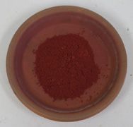
Red (iron oxide, Fe2O3) is made simply by heating the yellow pigment in a kiln. Above 100°C it begins losing its water of hydration, and as the temperature increases, the resulting iron oxide particles begin to fuse together and grow in size. Consequentially, the shade of the pigment corresponds to the temperature which it was heated to, ultimately becoming a dull violet at a temperature of around 1000°C. The reddest pigment, however, is formed at around 900°C. In oil, this pigment forms a smooth paint with immense covering power, yet which still mixes well with other colors due to its low intensity. It is absolutely stable; the color does not shift at all as it dries.
|
|---|
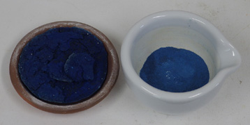
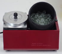
Blue (calcium copper silicate, CaCuSi4O10) is the world's oldest synthetic pigment; it was originally made by the Egyptians and known to the Romans as caeruleum, and was produced by heating malachite with ash and sand. Using finely powdered modern materials, I found that a mixture of one part baking soda, two parts calcium carbonate, two parts copper carbonate, and five parts silica (by weight) produces a deep blue pigment cake when heated to 900°C and allowed to cool slowly. The copper carbonate can be supplied from the green pigment, the ingredients can be mixed by shaking them together in a jar, and a terra cotta dish can be used as a crucible. Overall the reaction is fairly reliable; however if the pigment is under-fired it will be gray and strongly alkaline, and if it is allowed to cool too quickly it will be pale blue and irregular in color. After firing, the pigment cake must be ground into a powder, the fineness of which determines its shade. Grinding by hand with a mortar and pestle can easily produce a coarse, bright blue pigment, while refining this further with a ball mill (in my case, a rock tumbler full of glass marbles) produces a soft gray-blue powder which is ideal for making paint. In oil the pigment becomes very dark and somewhat transparent, and the resulting deep indigo paint mixes well with white to produce subtle blues. Its stability is unique among copper colors, rivalling that of red iron oxide, which is in many ways its closest equivalent.
The above pigments span the entire color wheel, and can be mixed freely with each other to produce intermediate hues. The low intensity of this palette ensures that no color will stand out unnecessarily, making it useful for coloring functional objects. The processes involved in making these colors can all be scaled up indefinitely, and are equally suitable for both small-scale and mass production. The reactions produce no hazardous waste and require no rare ingredients, and will tolerate low-quality starting materials without issue. Overall, I am entirely satisfied with the pigments described here, and I look forward to exhibiting their colors in the projects and articles to come.