Colors are an essential aspect of physical objects, and are often the first characteristic mentioned when describing them. Unfortunately, they are often chosen as an afterthought in the design process, as they are commonly understood to be purely aesthetic in nature. This is a misconception, however. Colors are of critical importance, and their usage is not entirely arbitrary. Their primary purpose is to differentiate between the physical features of an object by giving the viewer's eyes well-defined targets to focus on. An object made entirely of the same color is camouflaged against itself, while an object with too many colors is chaotic and difficult to look at. Therefore, some middle ground must exist, in which a well-defined set of colors produces objects with similarly well-defined features, and in which the use of colors can be simplified. This set of colors is defined by the following guideline:
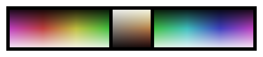
But what is the natural gradient? Shown above at the center of the page, the natural gradient spans from the palest yellow to the darkest red, at any level of saturation including gray. These are the colors of natural materials, and by that virtue they are always pleasing to the eye. Because of this, they can be used freely in any combination, while never producing an unpleasant color scheme.
Alongside this gradient, a single arbitrary color may be used; this color can be found anywhere in the visible spectrum, including within the natural gradient itself. As long as this color is used alone, or kept within a narrow range of hues, it can be used anywhere on an object without becoming distracting.
Additionally, while the level of saturation is not strictly defined by the above guideline (any level of saturation may be used), the context of the object should be taken into account. Saturation in color is analagous to volume in sound, and so should be matched to the environment in which the object is to be used. This ensures that too "loud" of an object does not become obnoxious, while too "quiet" of one does not go overlooked.
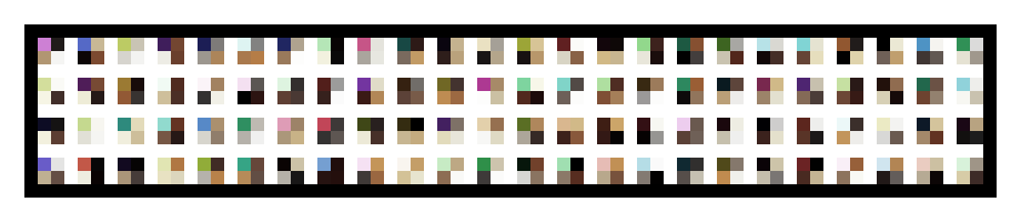
As proof of the above concept, I generated a randomized set of color schemes, each containing one arbitrary color alongside three colors from the natural gradient. These can be seen below, and while not all are applicable to every situation, none are unpleasant to look at. At this point, I believe my conceptual articles have created a well-defined set of guidelines for the creation of physical objects, which I will adhere to closely in all future projects in order to more thoroughly test their practicality. More ambitiously, it is my hope that by distilling aesthetics down to a fixed set of procedures, a more beautiful world can be created from the objects used within it.